Adding Timeline Slicers to PowerPivot Dashboards
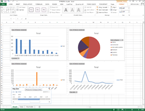 PowerPivot has a couple of extra features that you can take advantage of while you are building your dashboards for slicing and filtering your data. One is called a Timeline Slicer.
NOTE: This is part of the Using PowerPivot to Analyze Your Dynamics AX Data blog series where we show how PowerPivot can assist you with advanced data analysis and reporting, making those extracts from Dynamics AX to Excel even more valuable. If you want to see all of the other posts in this series, click here.
HOW TO DO IT
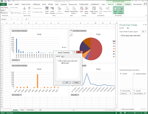
To add a Timeline Slicer to your PowerPivot Dashboard, follow these steps:
- From the Analyze ribbon bar within Excel, click on the Insert Timeline from within the Filter group.
- When the Insert Timeline dialog box is displayed, any field that is formatted as a date will be available to be added as a Timeline slicer. Select one and then click on the OK button.
HOW IT WORKS
Now you can filter the data that is displayed by date range with the slicer.


Reblogged this on Блог Антона Палихова.