Using PowerPivot to Create Dynamics AX Dashboards
 PowerPivot gives you all of the capabilities that the Pivot Tables have, plus more. With PowerPivot you can create pivot tables and charts, and also dashboards with multiple panels showing that use the same data source.
NOTE: This is part of the Using PowerPivot to Analyze Your Dynamics AX Data blog series where we show how PowerPivot can assist you with advanced data analysis and reporting, making those extracts from Dynamics AX to Excel even more valuable. If you want to see all of the other posts in this series, click here.
HOW TO DO IT
To access the data tables through the PowerPivot Manager and also create more elaborate dashboards, follow these steps:
- To use a data table within PowerPivot, all you need to do is add it to the PowerPivot data model by clicking on the Add to Data Model button within the Tables group of the PowerPivot ribbon bar.
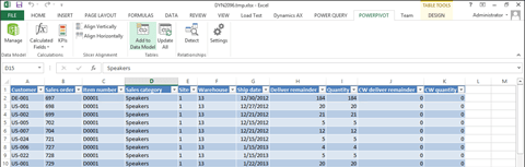
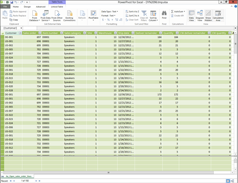
- This will open up the PowerPivot Data Manager view with all of the table data being displayed.
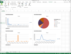
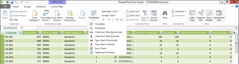
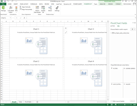
- To create a dashboard from the data, click on the PivotTable button within the Linked Table ribbon bar. You will be able to choose from a number of different dashboard designs, for this example we will choose the Four Charts option.
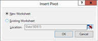
- PowerPivot will return to the Excel worksheet and ask us where we want to put the dashboard. Select the New Worksheet option and click the OK button.
- Rather than just seeing the one panel that was available with the Pivot Chart option, PowerPivot will add multiple reporting panels.
HOW IT WORKS
You can then build the reports individually.
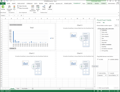
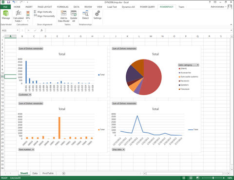
Repeating the process for the other panels will give you a multipanel dashboard for reporting off your data.

Reblogged this on Блог Антона Палихова.
Reblogged this on Блог Антона Палихова.
Reblogged this on Блог Антона Палихова.